February 22, 2020 ( last updated : February 21, 2020 )
html
css
https://github.com/gmm117/gmm117.github.io
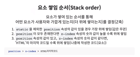
css 속성 우선순위
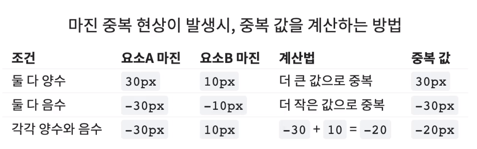
css 마진 중복(collapse)
box-sizing
overflow
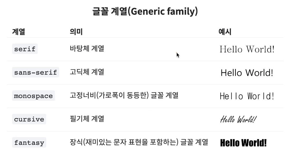
font
float
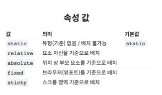
position
flex
Grid
background
<body>
    <div id="color_yellow" class="color_green" style="color : orange;">Hello world</div>
</body>

<!-- div { color : red !imprtant; } /* important */

     #color_yellow { color : yellow; } /* 아이디 선택자 */

     .color_green { color : green; } /* 클래스 선택자 */

     div { color : blue; } /* 태그 선택자 */

     * { color : darkblue; } /* 전체 선택자 */

     body { color : violet; } /* 상속 */
-->
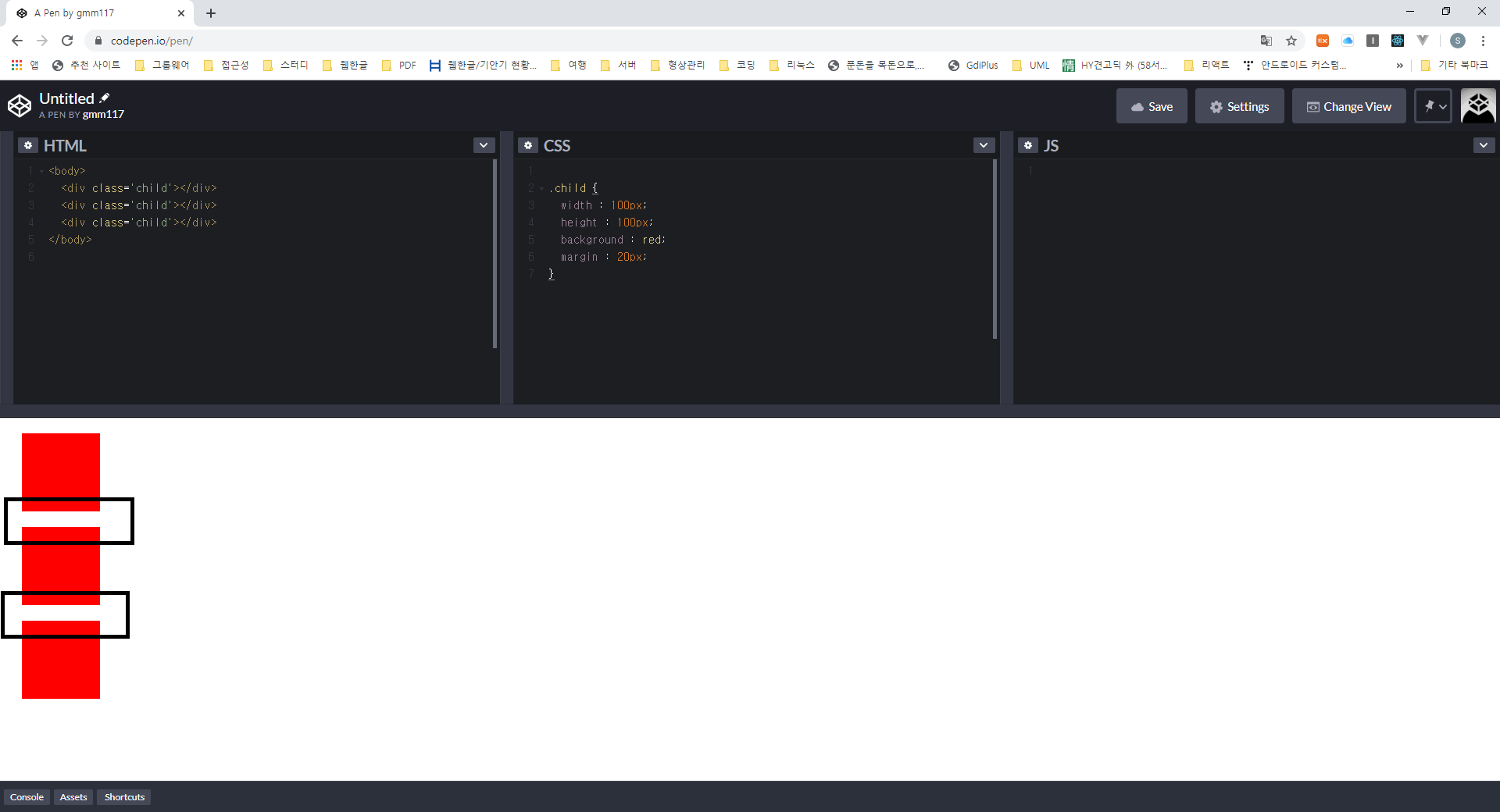
<body>
  <div class='child'></div>
  <div class='child'></div>
  <div class='child'></div>
</body>

.child {
  width : 100px;
  height : 100px;
  background : red;
  margin : 20px;
}
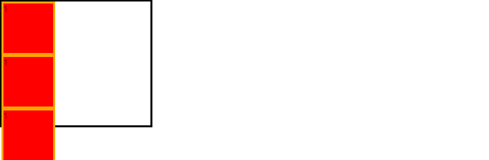
<body>
  <div class='child'></div>
</body>

.child {
  width : 100px;
  height : 100px;
  background : red;
  padding:20px;
  border:10px solid orange;
  box-sizing : border-box;
}
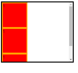
<div class='parent'>
  <div class='child'>1</div>
  <div class='child'>1</div>
  <div class='child'>1</div>
</div>

.parent {
  width : 300px;
  height : 250px;
  border : 4px solid;
  /* overflow : visible; */
  overflow : auto;
}
.child {
  width : 100px;
  height : 100px;
  background : red;
  border:4px solid orange;

}
.box {
  font : italic bold 20px / 1.5 "Arial", sans-serif;
}

.box {
  font : 30px / 1.5 sans-serif;
  font : bold 30px sans-serif;
  font : italic 30px / 1.5 "Arial",sans-serif;
}
<div class="parent clearfix">
  <div class="child>
  /*"" clear:both, display:block*/
</div>

.clearfix::after {
  content:"";
  clear:both;
  display:block; /*after,before inline 요소로 변경*/
}
.child {
  float : left;
}

<span>1</span>
<span>2</span>
<span>3</span>

.span {
  width : 100px;
  height : 100px;
  margin : 10px;
  background : red;
  float : left;
}
<div class="parent">
  <div class="child"></div>
</div>

.parent {
  position : relative;
}

.child {
  position : absolute;
  top : 50px;
  left : 100px;
}
/* 배너 광고처럼 뷰포트 기준으로 위치가 고정된다. */
<div class="parent">
  <div class="child"></div>
</div>

.body {
  height : 4000px;
}

.child {
  position : absolute;
  bottom : 50px;
  right : 10px;
}
 .box1 {
   background : red url("../img/image.jpg") no-repeat left top scroll;
 }
 .box2{
   background : url("../img/image.jpg") no-repeat right 100px;
  }
 .box3 {
   background : red;
 }
<div class="container">
  <div class="item"></div>
  <div class="item"></div>
  <div class="item"></div>
</div>
.container {
  border : 2px solid red;
}

 .container .item {
  width : 100px;
  height : 100px;
  border : 2px solid;
  border-radius : 10px;
}
  .container {
    border : 2px solid red;
    display : flex;
  }
.container .item {
  ...
  display : inline;
}
.container {
...,
font-size : 0;
}
.container .item {
...,
display : inline-block;
font-size : 16px;
}
<div class="container clearfix">
  ...
</div>
.clearfix:after {
  content : "";
  display : block;
  clear : both;
}

.container .item {
  ...,
  float : left;
}
<div class="container">
  <div class="item">1</div>
  <div class="item">2</div>
  <div class="item">3</div>
  <div class="item">4</div>
  <div class="item">5</div>
  <div class="item">6</div>
</div>
.container {
  border : 4px solid;
  display : flex;
}

.container .item {
  width : 100px;
  height : 100px;
  background : tomato;
  border : 4px dashed red;
  border-radius : 10px;
  display : flex;
  justify-content : center;
  align-items : center;
}
 <div class="container">
  <div class="item">1</div>
  <div class="item">2</div>
  <div class="item">3</div>
  <div class="item">4</div>
  <div class="item">5</div>
</div>
.container {
  display : grid;
  grid-template-rows : repeat(2, 100px) /*100px 100px*/;
  grid-template-columns : repeat(3, 1fr); /* 1:1 비율로 열을 생성*/
  border: 4px solid lightgray;
}

.container .item {
  border: 2px dashed red;
}
Originally published February 22, 2020
Latest update February 21, 2020
Related posts :